Flutter
Making Flutter's public face as consistent as its framework
Client

Flutter
Role
Brand & Web Design Partner
Timeline
10–12 weeks
Scope
Tech Stack
The Brief
The previous flutter.dev had all the expected ingredients — a confident blue-and-white palette, Google Sans, clear product messaging — but it lacked internal consistency. Components drifted. Type scales weren't applied uniformly. Color usage varied enough across sections that the site read as assembled rather than designed. For a framework that leads with pixel-level control as a core selling point, the gap between the product's promise and the site's execution was noticeable to any developer paying attention. The team needed outside help because the problem wasn't one missing design file — it was the absence of a shared system that could govern decisions across contributors and over time. Internal bandwidth wasn't the issue so much as the need for someone to step back, audit the full scope of inconsistency, and build the infrastructure to fix it systematically rather than patch by patch. Boneyard's profile — a small senior team with design and strategy under one roof, capable of both the audit and the execution — was the right fit for work that required judgment about what to keep, what to resolve, and what to codify.
What we did
The first decision was to treat the design system as the primary deliverable, not a supporting document. Visual and UX refresh decisions were made in that order: establish the system first, then apply it. That meant auditing the existing site against its own brand intent, identifying where drift had occurred (type scale inconsistencies, ad hoc color variations, component fragmentation), and making explicit choices about the canonical version of each element. We chose to stay close to the existing palette and type choices rather than introduce new brand directions — Flutter has real equity in its visual language, and the goal was coherence, not reinvention. The design system we built was extensive: tokens for color, typography, spacing, and elevation; a component library covering the full range of page elements; and documentation clear enough to serve as a handoff artifact for internal teams. The visual and UX refresh was staged — system foundations first, then page-level application — so decisions made early could propagate consistently rather than requiring reconciliation at the end. The result is a site that looks like one team made deliberate choices throughout, because now there's a system that enforces exactly that.
The outcome
Post-refresh, flutter.dev reads with a consistency it didn't have before — the same visual logic visible on the homepage carries through to deeper documentation and ecosystem pages. The design system gives the internal team a shared language for decisions that previously got made ad hoc, which means future contributors can maintain that consistency without needing to reverse-engineer intent from existing pages. The more durable outcome is strategic: a framework that markets itself on craft now has a public presence that holds up to scrutiny from the developers evaluating it. The gap between what Flutter promises — fine-grained control over every pixel — and what its own site demonstrated is closed.
Part 01
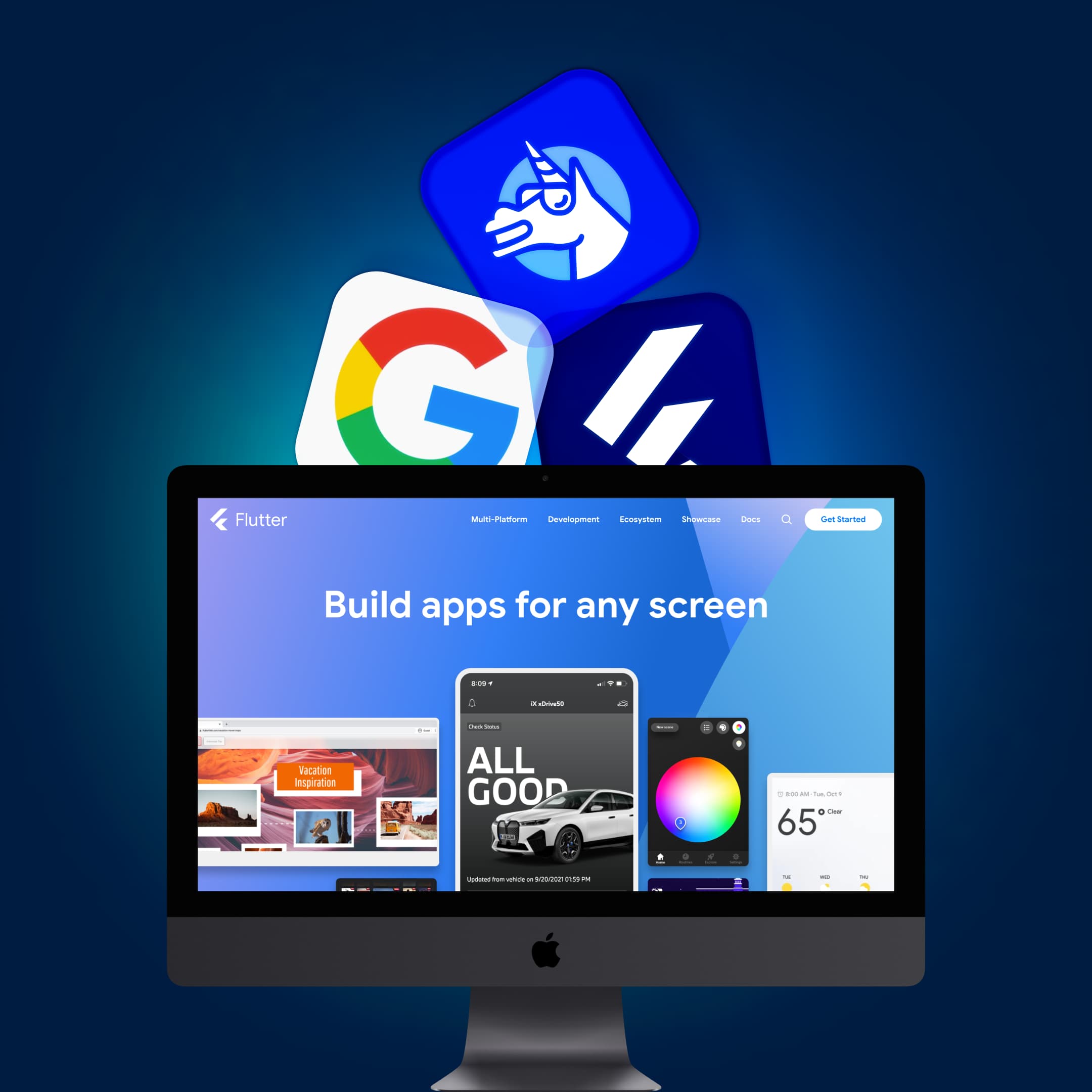
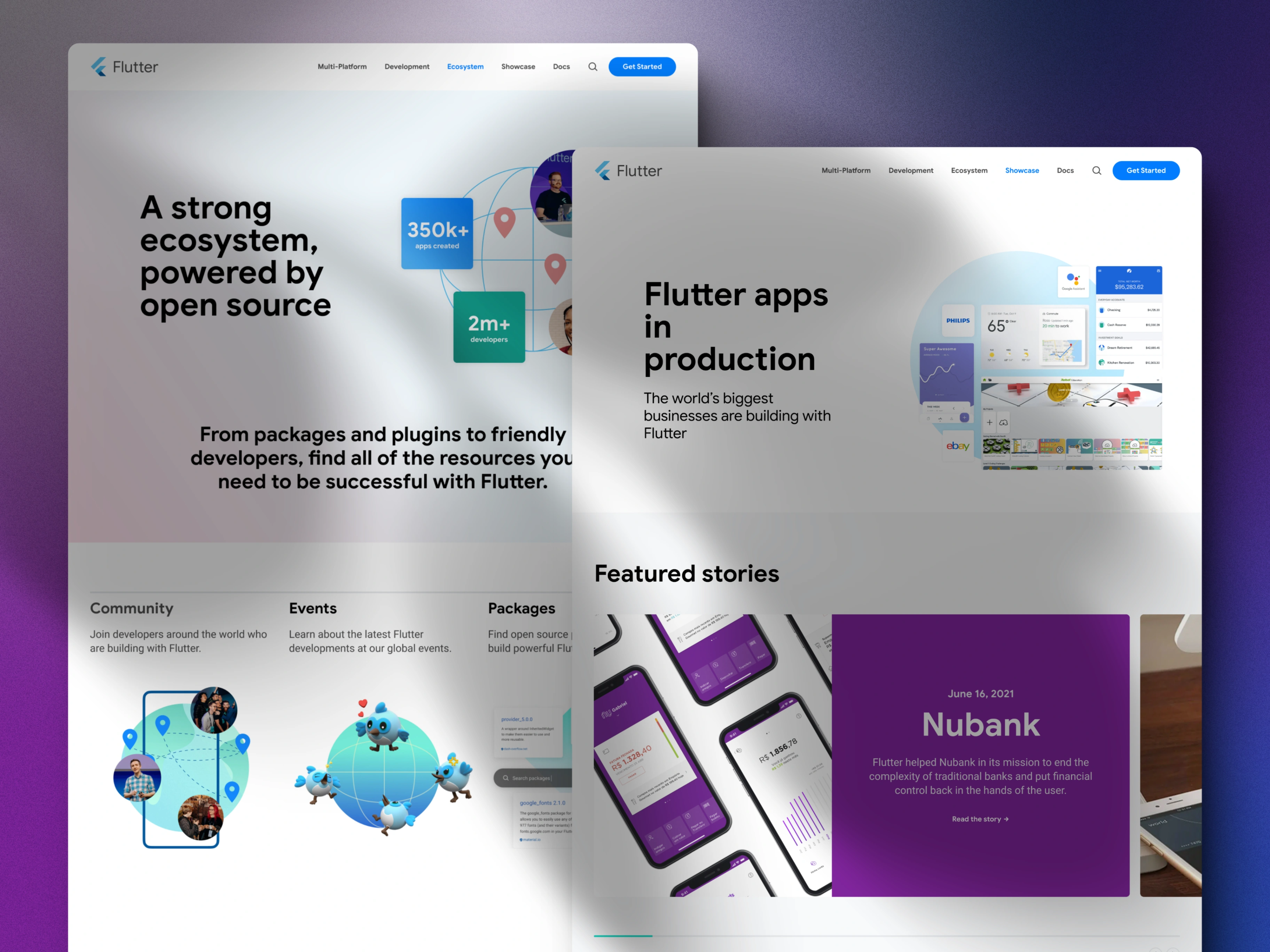
What the site was saying
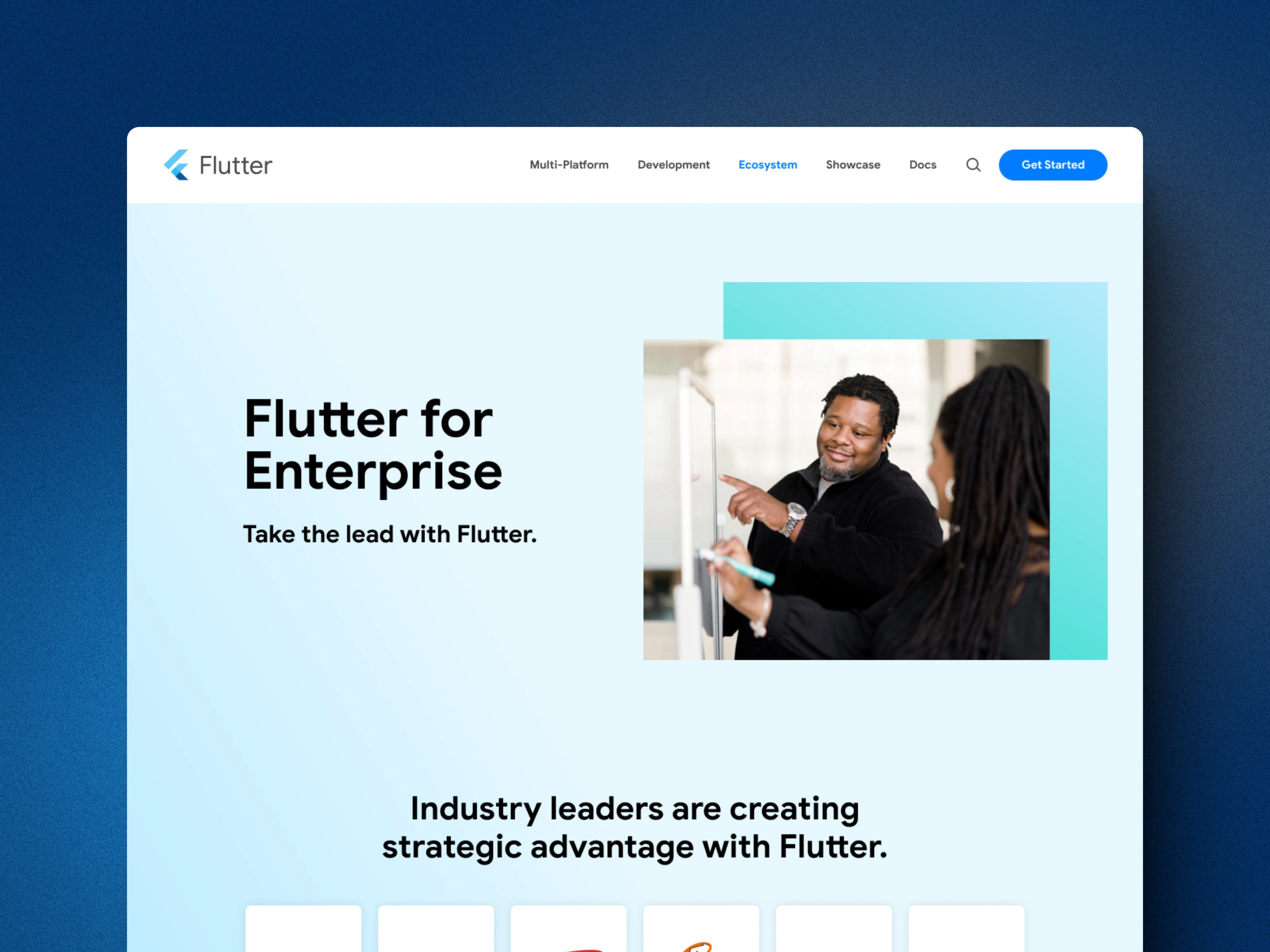
Flutter's homepage had strong bones — a confident palette, clear hierarchy, recognizable product voice. But the further you got from the hero, the more things drifted. Component treatments varied. Type scales weren't consistent across sections. The site read as accumulated rather than designed, which mattered a lot for a product that competes on UI quality.
Part 02
Auditing the drift
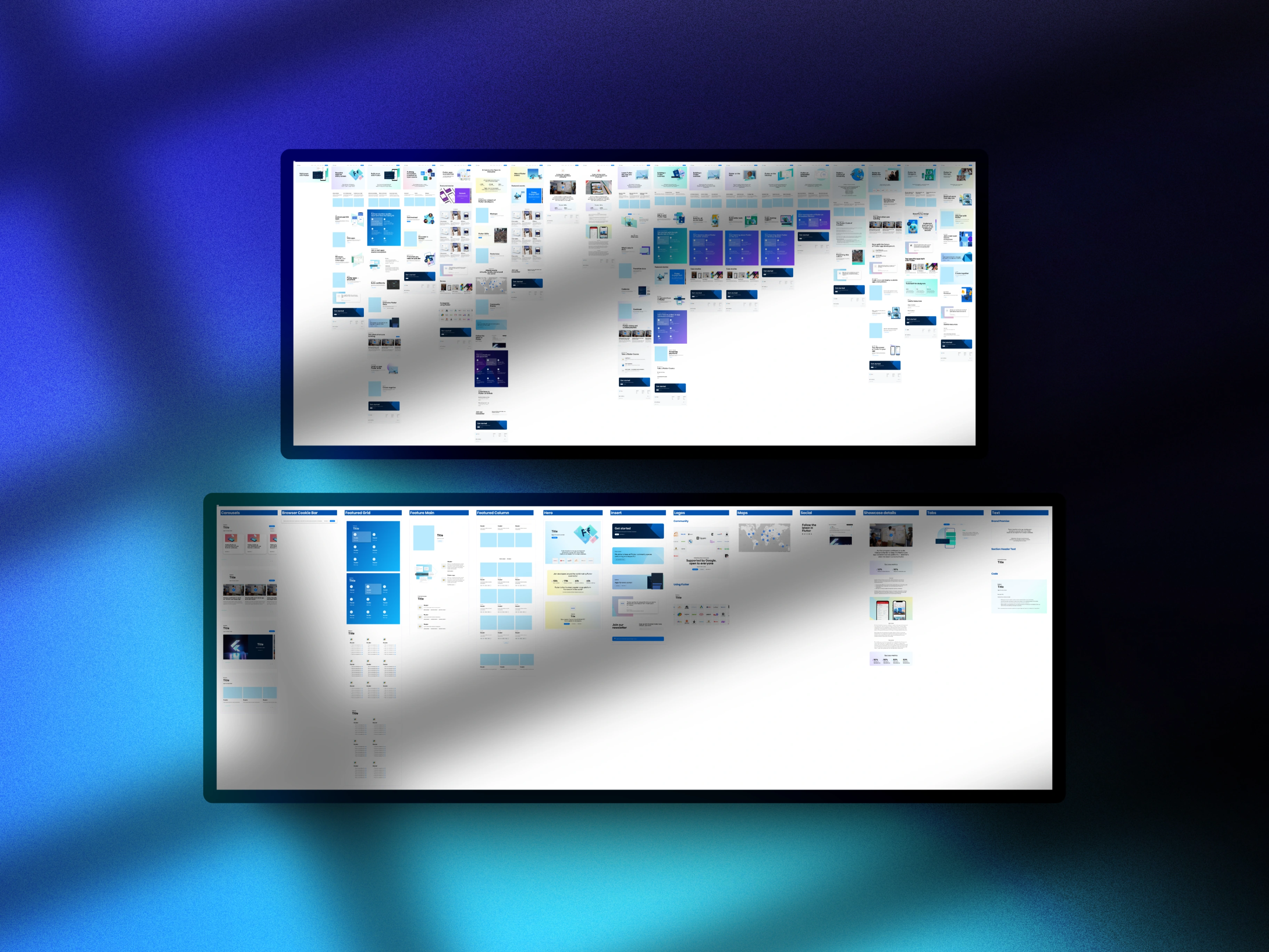
The first phase was a full audit of the existing site against its own brand intent — not against a hypothetical ideal, but against what the site was clearly trying to be. We catalogued color inconsistencies, type scale deviations, and component fragmentation across every major section. The audit made the scope of the problem legible and surfaced which inconsistencies were cosmetic versus structural.
Part 03
Building the token layer
Rather than fixing pages one at a time, we started with the foundation: a complete token system for color, typography, spacing, and elevation. Every decision about the visual refresh flowed from the tokens first. This meant changes could propagate correctly and future contributors would have a single source of truth to work from rather than inferring intent from existing pages.
Part 04
Resolving the palette
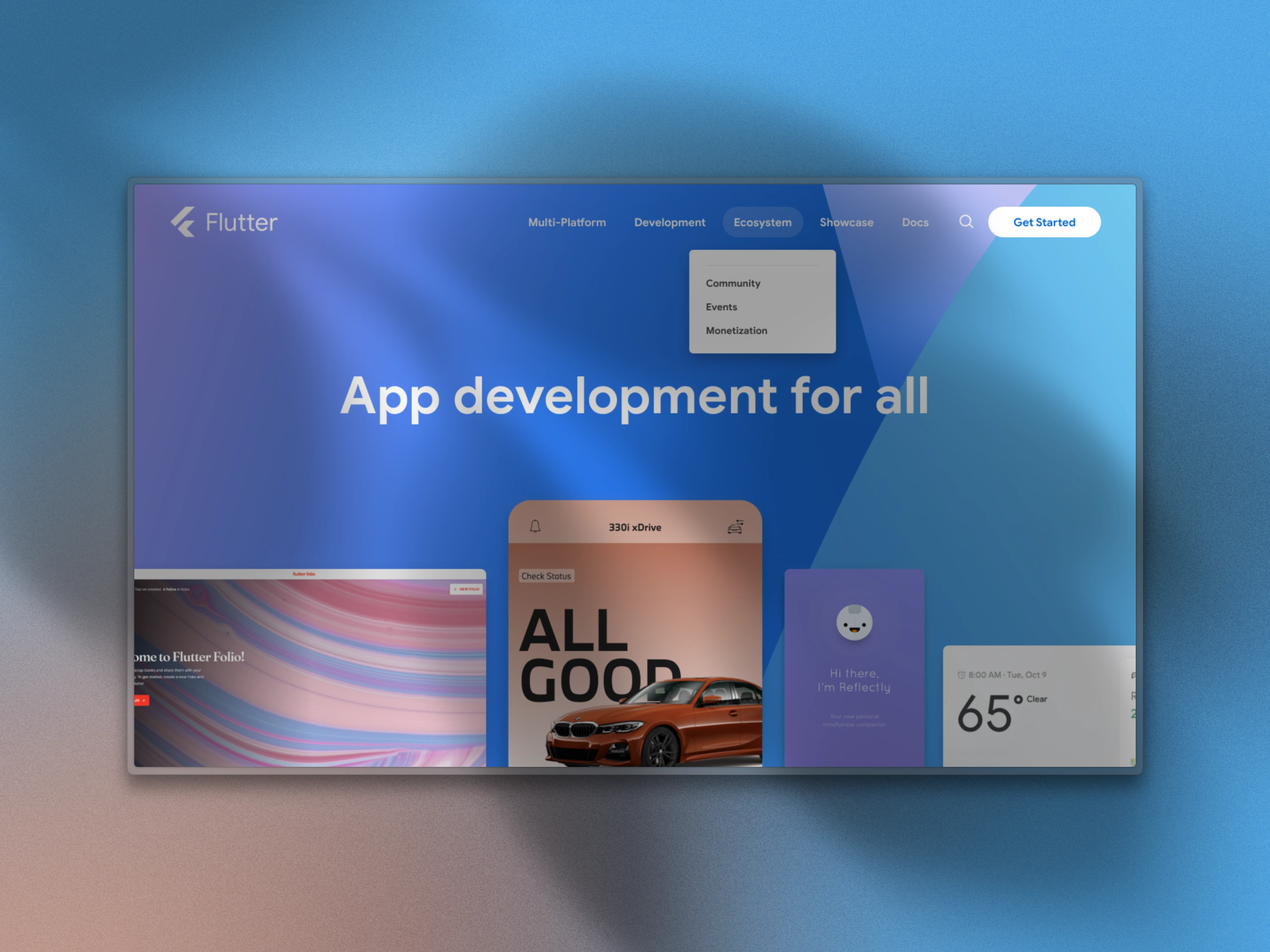
The existing palette — deep navy, Flutter blue, soft sky backgrounds — had real brand equity. The problem was inconsistent application: tints used in one place, flat fills in another, accent colors appearing at different weights across sections. We codified the canonical usage rules and resolved the variations, keeping the palette recognizable while making it internally coherent.
Part 05
Type scale, made explicit
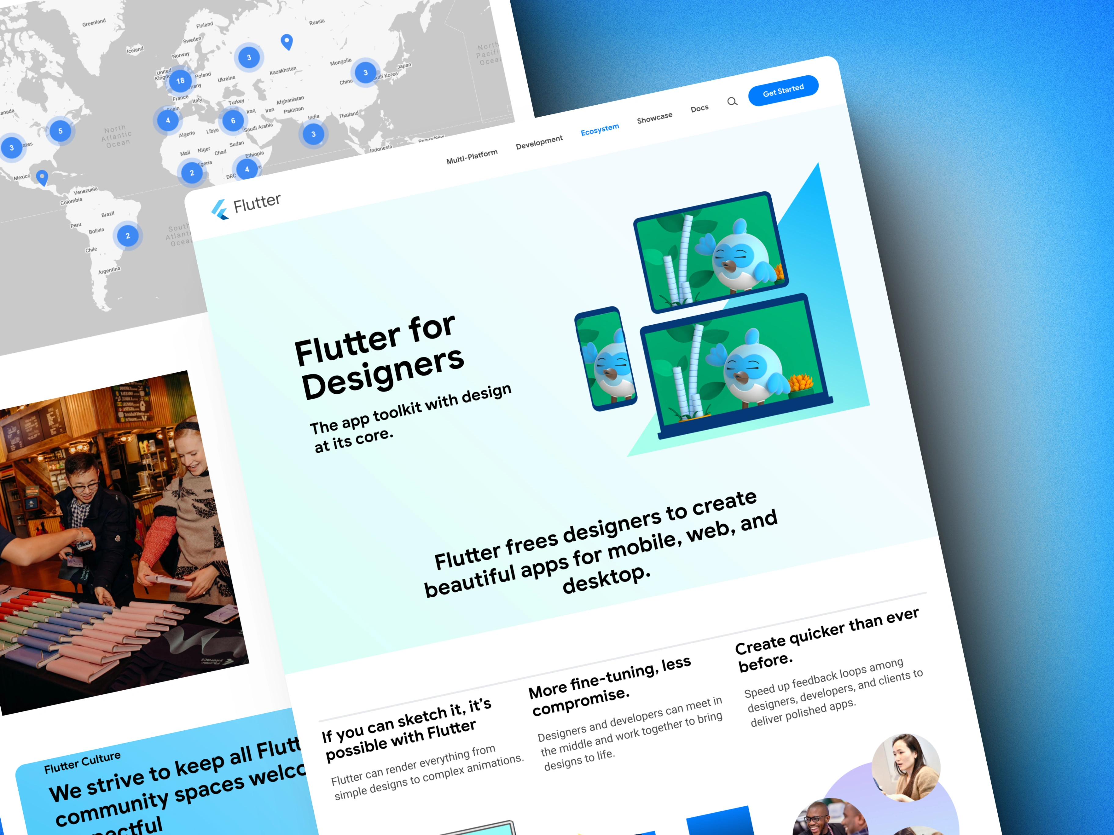
Google Sans and Roboto were already in use, but without a rigorous scale applied consistently across the site. We established a clear type system — sizes, weights, line heights, and usage rules for headings, body, UI labels, and code — and documented it as part of the design system. The difference shows most clearly in the documentation sections, where type hierarchy does heavy lifting.
Part 06
Component library
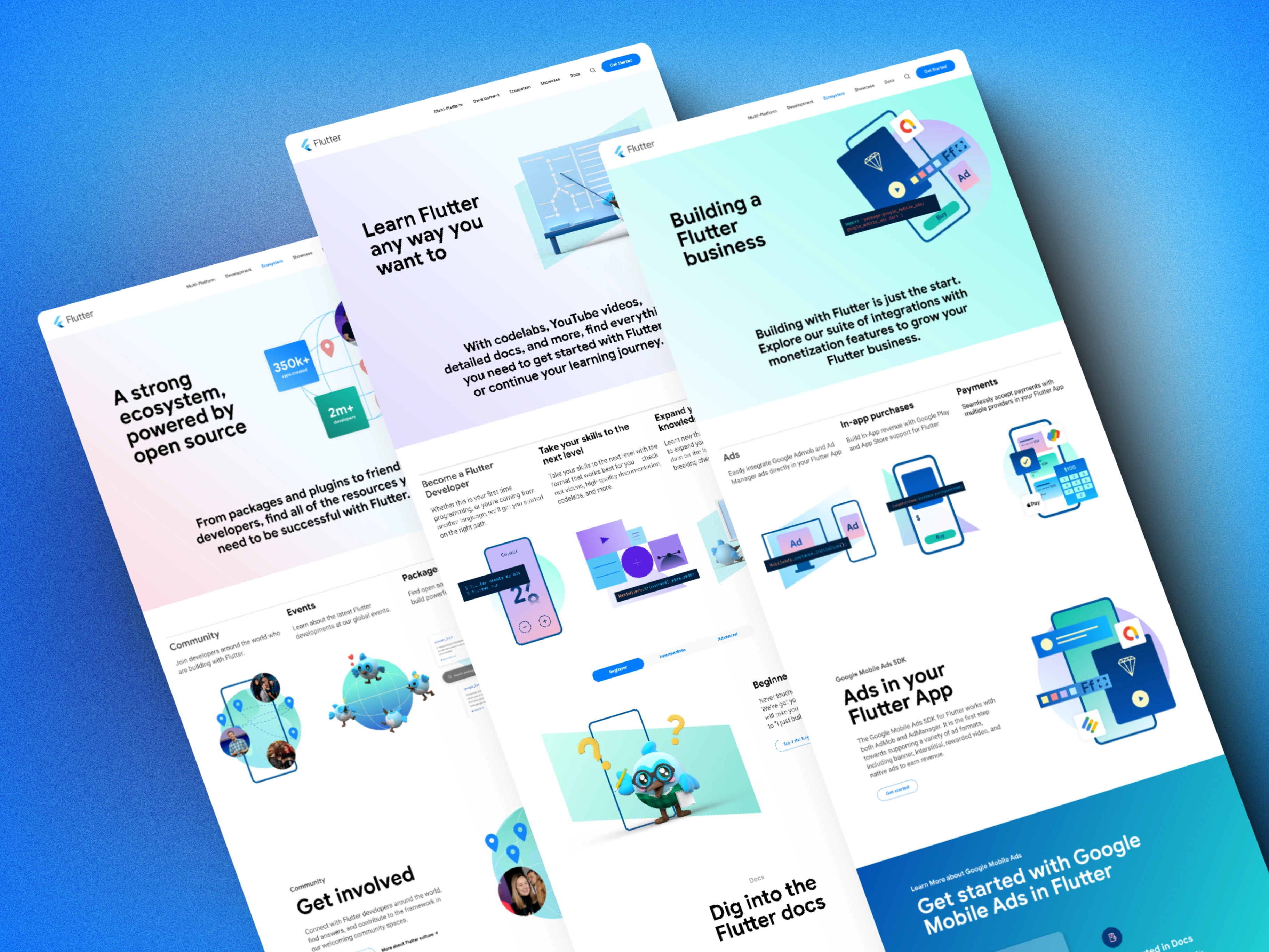
The component work covered the full range of page elements: navigation, cards, CTAs, feature blocks, code samples, and ecosystem showcases. Each component was built against the token foundation so visual changes made at the token level ripple through correctly. The library was documented to function as a handoff artifact, not just a design reference.
Part 07
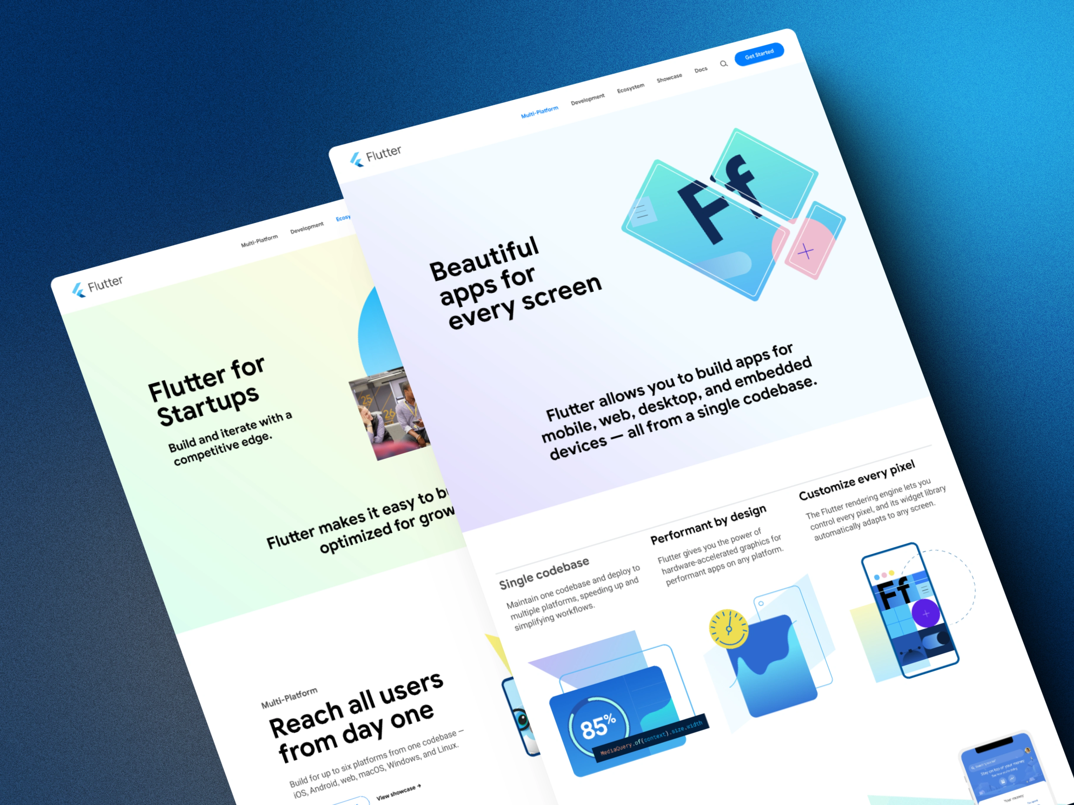
Page-level application
With the system in place, we applied it across the site's key pages — homepage, development sections, ecosystem pages, and the community areas. The refresh wasn't about introducing new visual ideas; it was about making the existing intent legible and consistent. Every section now reads as a product of the same design decisions.
Part 08
The outcome is a system
The design system is the lasting deliverable here. The visual refresh fixes what was broken now; the system prevents it from drifting again. Internal contributors have a shared language for decisions that were previously made ad hoc, which means flutter.dev can keep pace with a fast-moving product without losing visual coherence.

Next Project
Very Good Ventures