Hush, Inc.
Building a beauty platform from startup provisional to acquisition ready
Client

Hush, Inc.
Role
Chief Designer & Design Director — Product, Brand, and Platform
Timeline
2 years
Scope
Tech Stack
The Brief
When the engagement began, Hush had a functional but underdeveloped product. The existing storefront leaned on a pink-and-coral palette with mixed typography — Larsseit, Baskerville, Bodega — that read as startup-provisional rather than considered. More critically, the brand system wasn't cohesive enough to hold across multiple surfaces: it worked well enough on desktop web but hadn't been designed with mobile-first depth or an Android surface in mind at all. App store ratings on iOS were averaging 3.5 stars with only 200 reviews, and there was no Android product. For a beauty platform, where trust and aesthetic credibility are purchase prerequisites, the gap between the experience and the category expectation was a real conversion problem. The inflection point was expansion ambition colliding with design ceiling. The team knew that unlocking Android was a revenue opportunity — but shipping a bad Android app would compound the existing credibility gap rather than close it. And investor conversations were starting to require a level of product vision and design coherence that couldn't be communicated with the existing assets. Hush needed a designer who could hold the full surface area — web, iOS, Android, brand, marketing — without fragmenting the product voice, and who could operate with enough seniority to represent design directly to investors. That profile pointed away from an agency that would hand off and walk away, and toward an embedded design leader who could build the team and the system simultaneously.
What we did
The first set of decisions was about scope and sequencing. Android came first because it was the clearest revenue unlock, and shipping it well meant resisting the temptation to port the iOS design directly. Android users have different interaction patterns and platform conventions; the app was designed to feel native to the platform while sharing a coherent visual language with iOS and web. On the brand side, the refresh prioritized sharpening what was already working — the warmth and accessibility of the Hush voice — over a dramatic overhaul. The palette was refined rather than replaced, and typography choices were made with system-level consistency in mind across all three surfaces. One deliberate tradeoff: rather than pushing toward a more editorial, high-fashion aesthetic that might have read as more premium, the brand stayed accessible and high-energy, because Hush's actual user base rewarded that register. Execution was structured around design documentation as a forcing function — every major decision was written up, which kept cross-functional communication tight and gave the growing creative team a shared reference point. The influencer batching tool was designed in parallel with the consumer product, treating it as a first-class design problem rather than an internal hack; the result was a 50% reduction in deal closure time and the ability to process 100+ contracts in a single cycle. In the second year, as the team scaled to three creatives, the design system and documentation built in year one became the onboarding substrate — new team members could contribute at quality without a long ramp.
The outcome
The quantitative outcomes were significant by any measure: over one million users on the platform, Android growing to account for more than 30% of total company revenue, and app store ratings climbing from a 3.5-star average on 200 reviews to a 4.8-star average across 50,000-plus combined reviews — a 37% improvement in iOS rating and 24% improvement in average rating overall. Those numbers reflect product decisions that compounded over time: a more coherent onboarding experience, a design system that let the team ship faster without sacrificing consistency, and a brand that could hold up in competitive advertising environments. The less quantifiable outcome was organizational: Hush arrived at the acquisition table with a functioning design team, a documented design system, and a product vision that had been stress-tested in direct investor conversations. The company's acquirer wasn't just buying a user base — they were buying a product organization with operational depth. The design work built during this engagement was a material input to that valuation.

Part 01
What we inherited
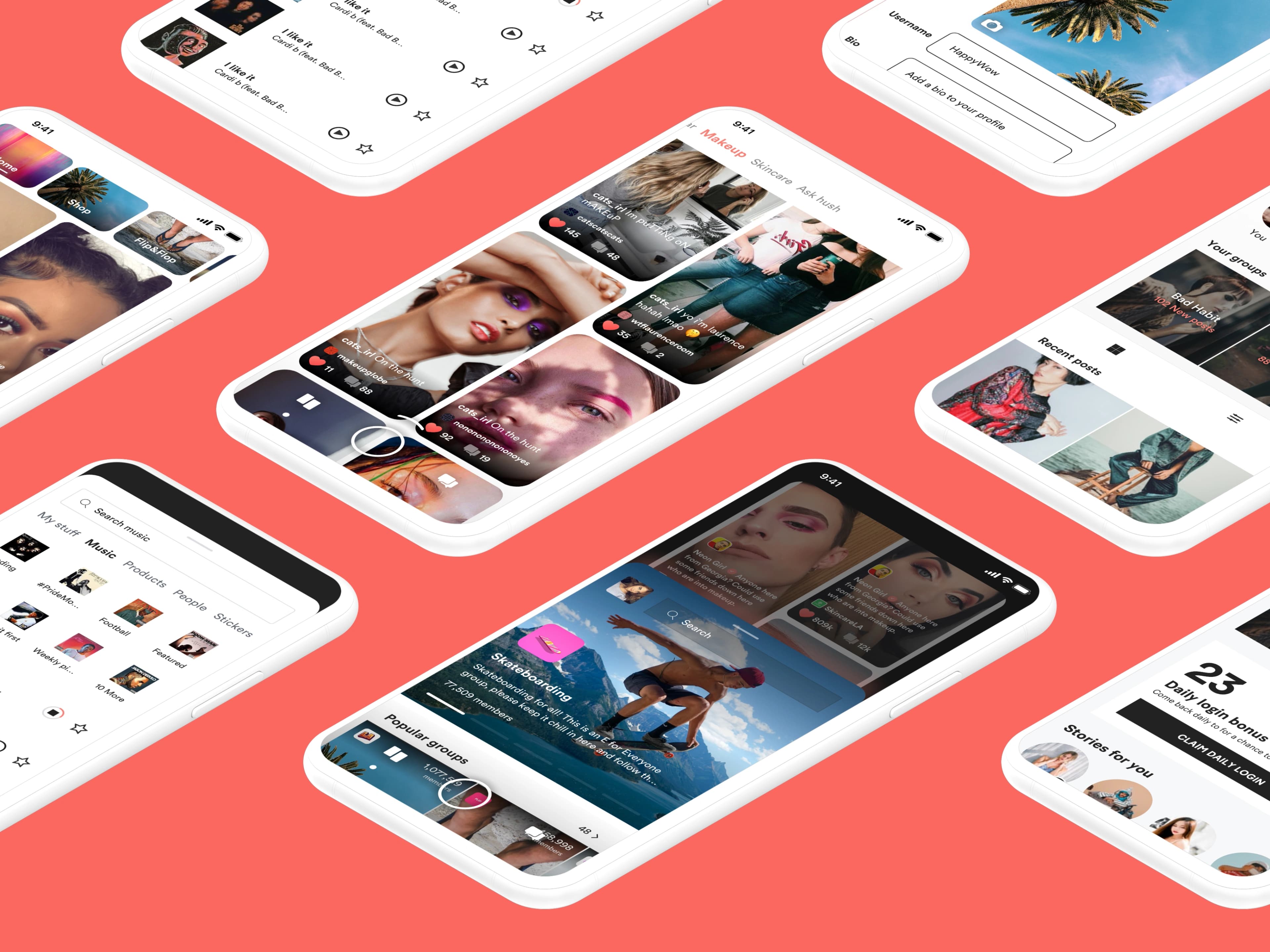
The existing storefront was a working product but not a finished one. The brand palette — pink, coral, a sharp red — had energy but no system behind it. Typography mixed editorial and grotesque faces in ways that read as provisional. On mobile, the gaps were more pronounced: iOS ratings were stalled at 3.5 stars, and there was no Android product at all.
Part 02
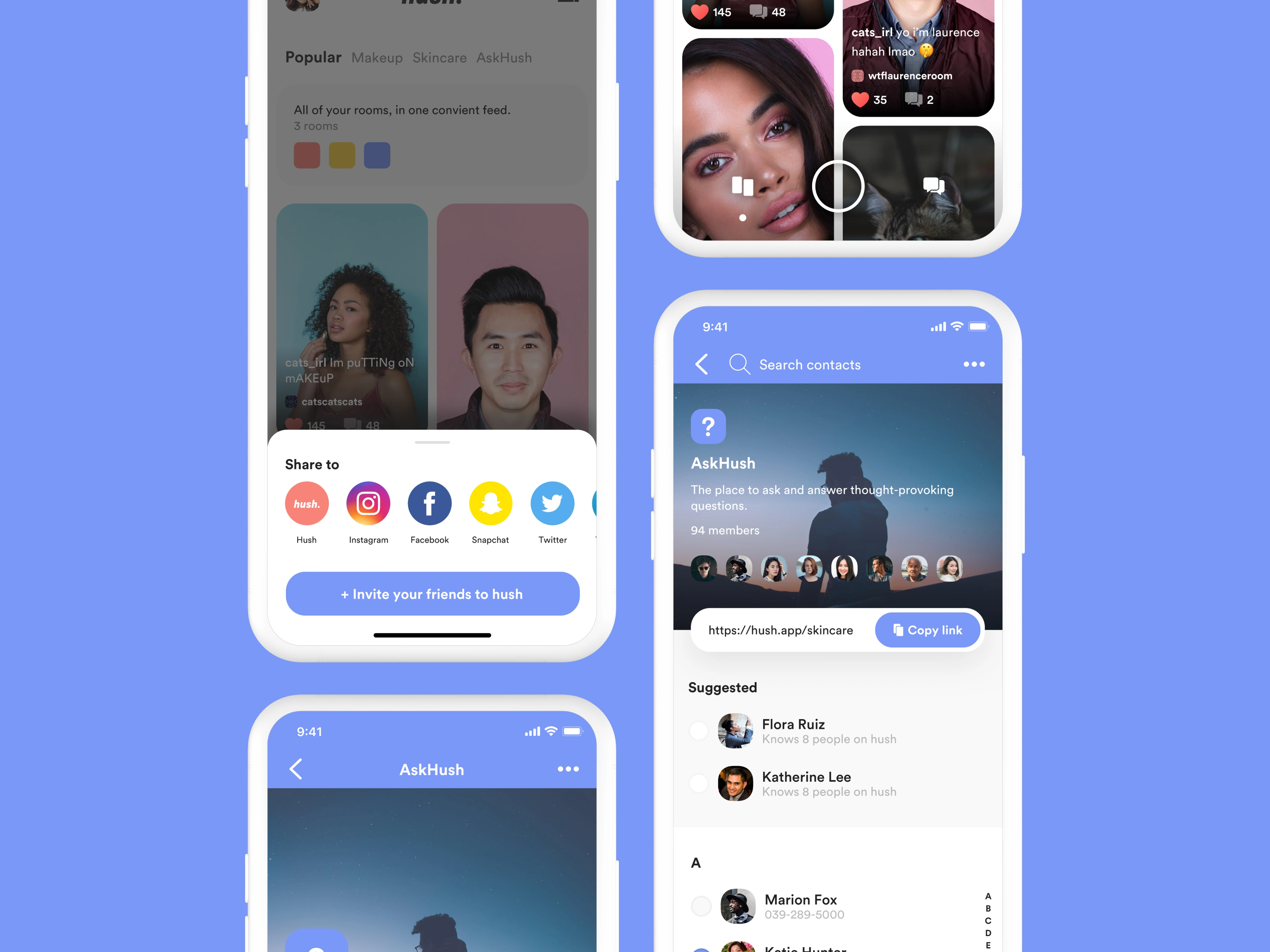
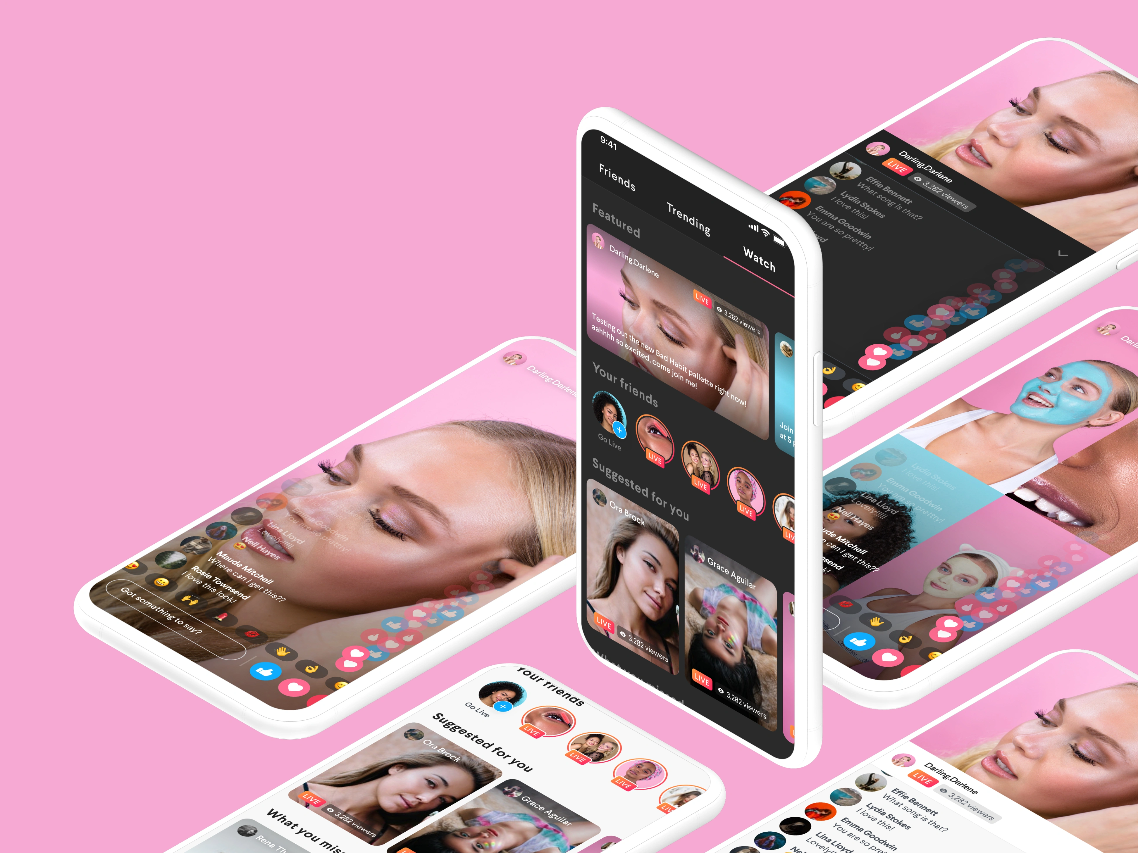
The Android decision
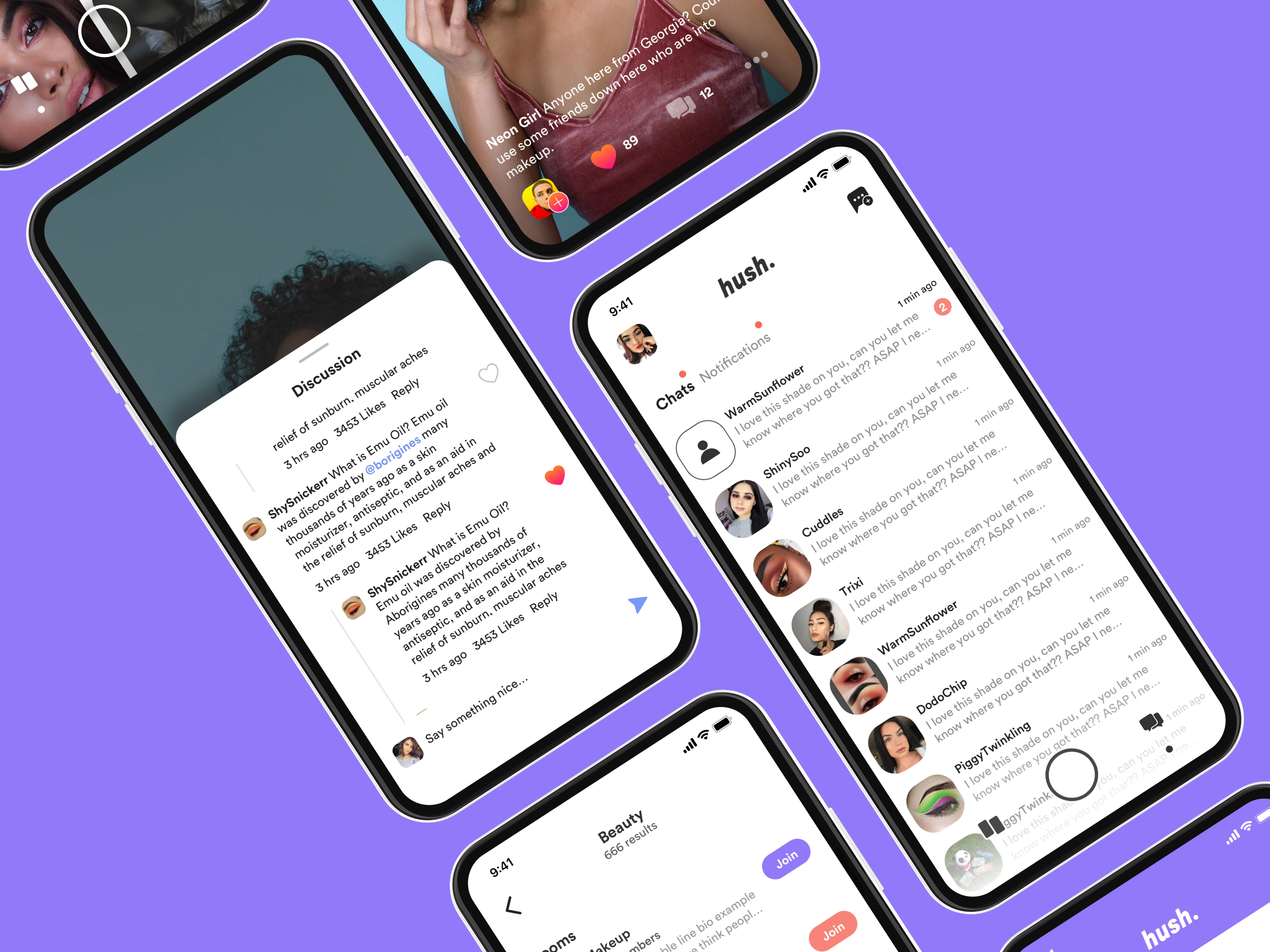
Android wasn't a port — it was a ground-up design for a different platform and a different user expectation. Navigation patterns, touch targets, and component hierarchy were rebuilt to feel native to Android while staying visually continuous with the iOS app. This wasn't a cosmetic difference; it was the thing that let the app earn trust on a new platform.
Part 03
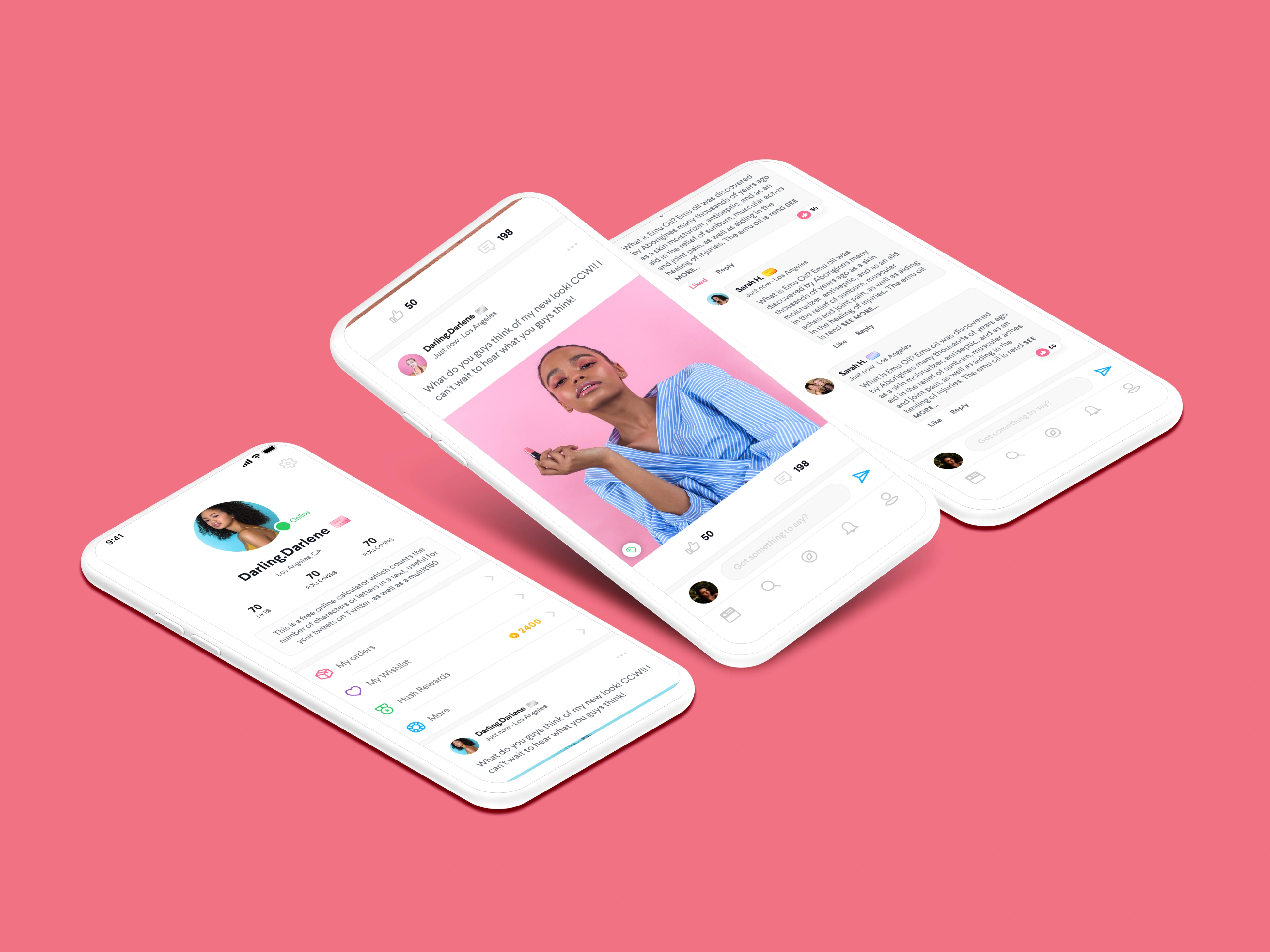
Sharpening the brand
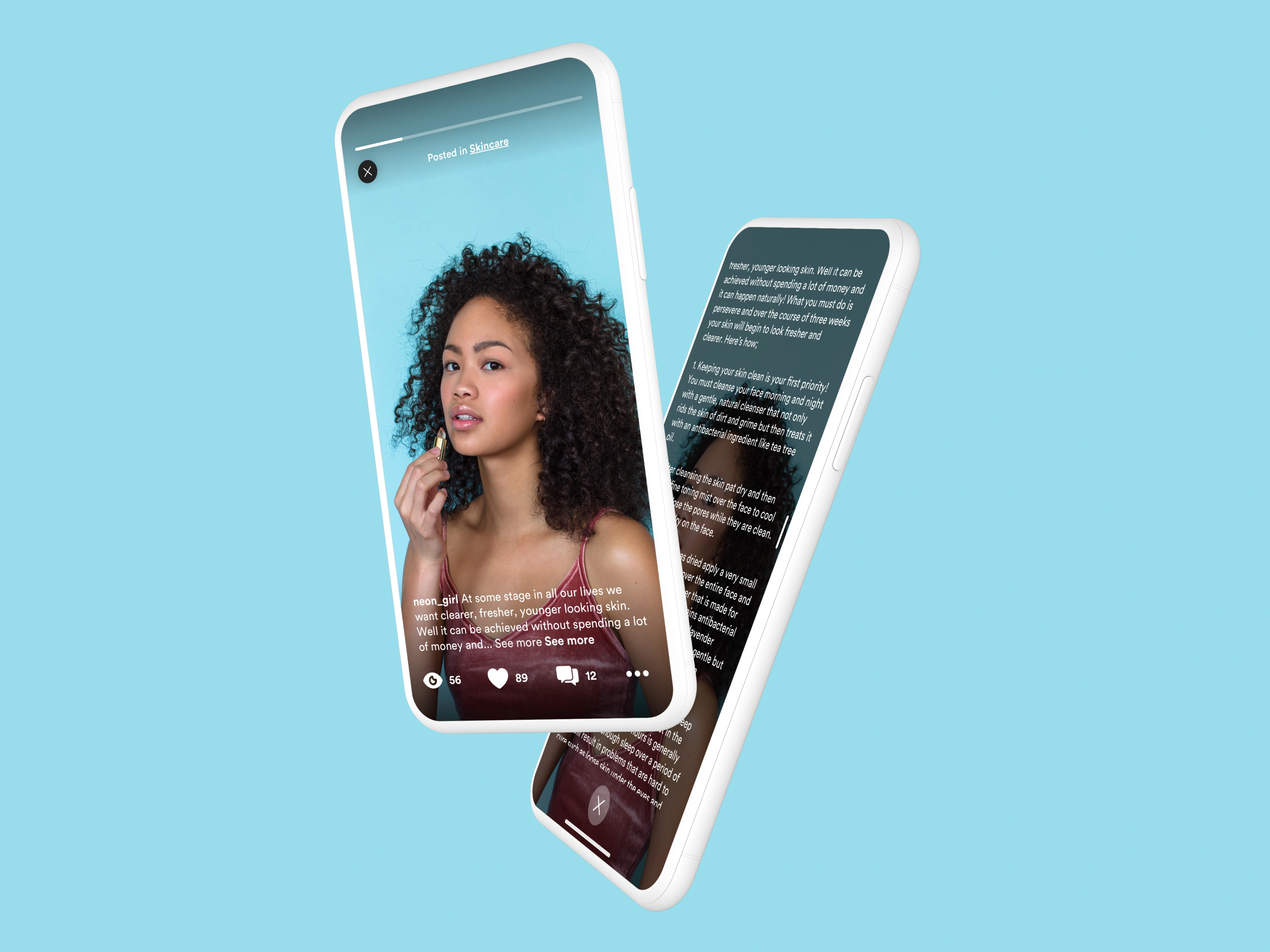
The brand refresh kept the warmth and accessibility that Hush users already responded to — this wasn't a repositioning exercise. The work was about giving the visual system enough structure to hold across web, iOS, Android, and marketing without fracturing. Palette refinement, type hierarchy, and a set of usage rules that could survive handoff to a growing team.
Part 04
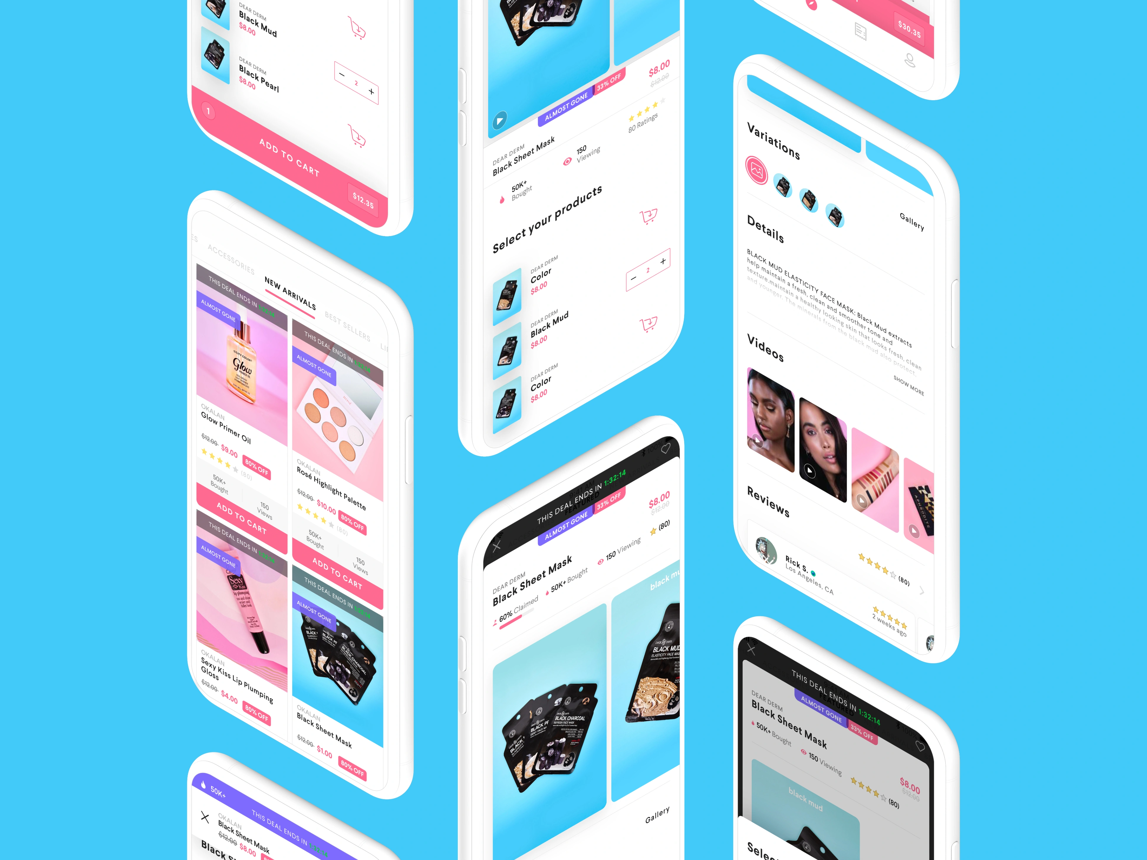
Redesigning the storefront
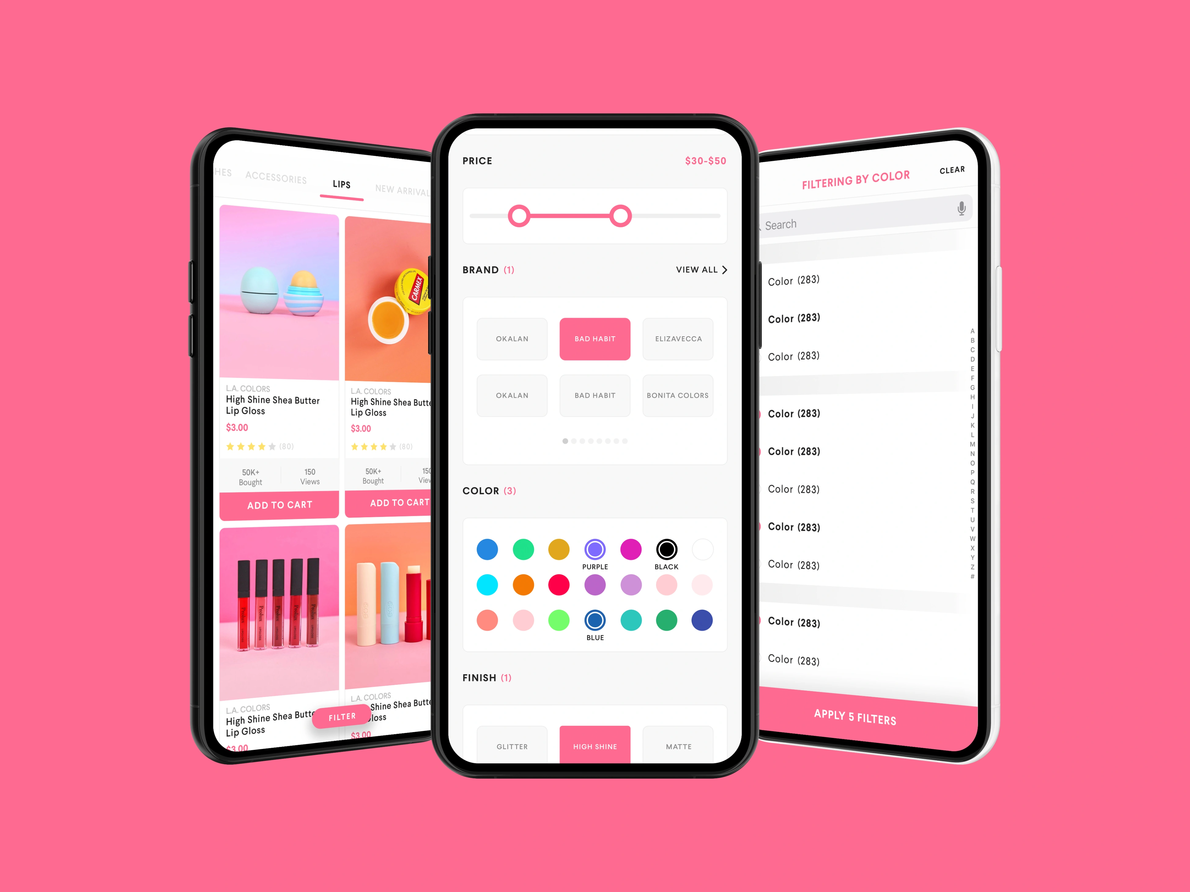
The web redesign touched navigation, category architecture, and the purchase funnel. The previous version had grown organically and showed it — fourteen-plus navigation links, category structures that reflected internal org rather than user mental models. The redesign pulled those back to a browsable, mobile-legible hierarchy that matched how beauty shoppers actually move through a catalog.
Part 05
The influencer tool
Alongside the consumer product, the team designed an internal batching tool for influencer contract management. The design problem was real: the manual process was a bottleneck that slowed deal closure and capped how many partnerships the business could run in parallel. The tool reduced closure time by 50% and unlocked 100+ contracts per cycle.
Part 06
Building a design system
Design documentation wasn't an afterthought — it was infrastructure. Every major decision was written up: rationale, tradeoffs, usage rules. When the team scaled to three creatives in year two, the system let new members contribute at quality without a long ramp. It also meant investor conversations could be backed with something more than mockups.
Part 07
Rating trajectory
The iOS rating improvement from 3.5 to a 4.8-star average across 50,000-plus combined reviews didn't happen from a single release — it was the product of user research feeding iterative decisions about onboarding, browse, and checkout. The Android app launched into that same flywheel and grew to account for 30% of total revenue.
Part 08
Designing for acquisition
In year two, the design roadmap was presented directly to investors. That meant the work had to communicate product vision, not just current state — showing a coherent system, a team with operational depth, and a brand that could compete in a crowded category. The acquisition by a competitor validated that the product organization had real value beyond the user base.
Part 09
What the company left with
By exit, Hush had a documented design system, a three-person creative team operating at senior quality, and a multi-surface product that had earned over a million users. The design infrastructure built during this engagement was part of what made the acquisition possible — not a cost center, but a strategic asset.
Next Project
NationBuilder