Very Good Ventures
Turning Flutter expertise into unmistakable market authority
Client
Very Good Ventures
Role
Brand, Design & Frontend Partner
Timeline
12 weeks
Scope
The Brief
The site VGV came in with was functional but visually indistinct. The palette — deep navy, flat blues, basic sans-serif — communicated 'software agency' without communicating anything specific about VGV. The information architecture had grown organically as the company added services, capabilities, and content categories; by the time they reached out to Boneyard, the nav carried too much weight and the homepage was doing too many jobs at once. Enterprise prospects landing on the site had no fast path to the proof points that would matter to them: flagship case studies, Flutter credentials, open source leadership. The brand wasn't broken — it just wasn't pulling its weight in a competitive sales context. The inflection point was a combination of product and market maturity. VGV had accumulated genuinely impressive client work, launched GenUI as a forward-looking capability, and grown into a recognizable name in the Flutter ecosystem. The old site couldn't hold all of that without feeling cluttered. Solving it in-house wasn't realistic — VGV's team is built for Flutter engineering, not for brand and product design at this level. They came to Boneyard specifically because of the combination: senior design and engineering under one roof, an eye for technical brands that need to feel premium without feeling over-designed, and a track record of building sites that hold up against serious competitors.
What we did
The core decision early on was to treat the brand identity as the foundation, not a downstream concern. We developed a new visual language — type system, color architecture, motion principles — before touching page layouts. This was deliberate: VGV's content is dense (services, industries, open source, thought leadership, case studies) and the only way to make that hierarchy readable was to establish a design system with enough structure to handle it. We chose a more confident, tighter typographic scale and refined the palette away from flat utility blue toward something with more range — allowing both editorial warmth and technical precision in the same layout. The tradeoff we made explicitly: we prioritized clarity and authority over visual novelty. This is a category where trust signals matter more than visual surprise. Execution was staged in three phases: brand foundations, UX design and page architecture, then frontend build. Boneyard handled all three. The design phase produced a full component library — not just page comps — so that the engineering phase had a real system to build from rather than a set of static screens. The frontend was built to handle VGV's content scale: case studies with long editorial layouts, a blog with multiple content types, service pages that needed to flex across different capability areas. Having design and development in the same team meant decisions about responsive behavior, animation, and component reuse got made once, with the right people in the room.
The outcome
The new site gives VGV a visual presence that matches their actual market position. Enterprise prospects arriving from a referral or a conference now land on something that reads as authoritative from the first scroll — the case study names are prominent, the capability areas are clearly differentiated, and the brand has enough visual confidence to sit credibly next to the companies VGV works with. Internally, the component system gives the VGV team a foundation for ongoing content — new case studies, blog posts, and service pages slot into the system without requiring design from scratch each time. The redesign didn't just update what was there; it gave the company a site infrastructure built for where they're going, not where they've been.
Part 01
What we inherited
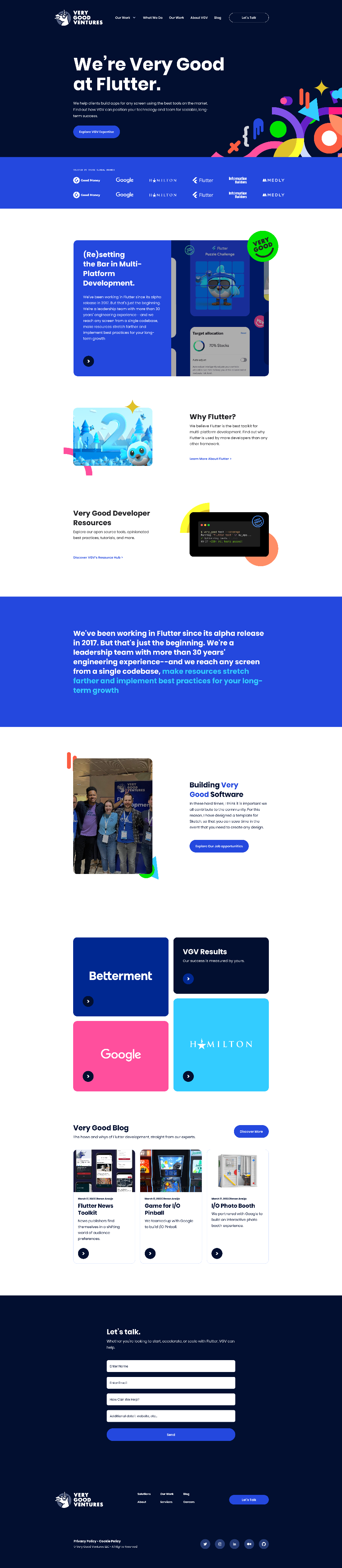
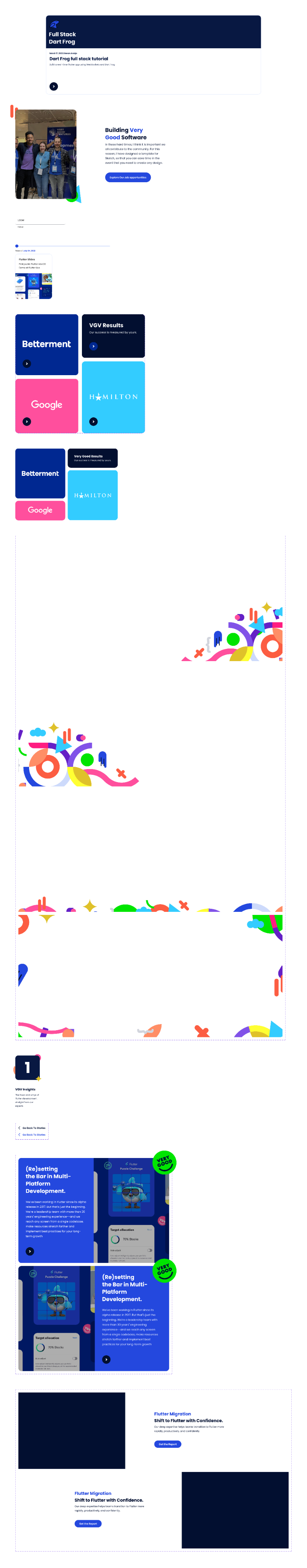
The previous site was a serviceable dark-navy layout with a functional blue accent and nav that had accumulated links over time. It communicated 'Flutter agency' but not 'the Flutter agency.' Enterprise clients doing their pre-call research weren't getting a fast read on what made VGV the right choice over any other capable technical shop.
Part 02
Starting with brand
Before touching a single page layout, we built out the visual language from scratch: type scale, color system, spacing tokens, motion principles. The decision to sequence it this way was intentional — with content as varied as VGV's, the system has to do a lot of structural work, and improvising it at the page level would have collapsed into inconsistency by the third template.
Part 03
A case for restraint
We moved away from the flat utility blue of the previous identity toward a palette with more tonal range — deeper neutrals, a colder accent that reads precision rather than friendliness, and more controlled use of color as a hierarchy signal rather than decoration. The bet was that VGV's clients respond to confidence and clarity, not visual expressiveness.
Part 04
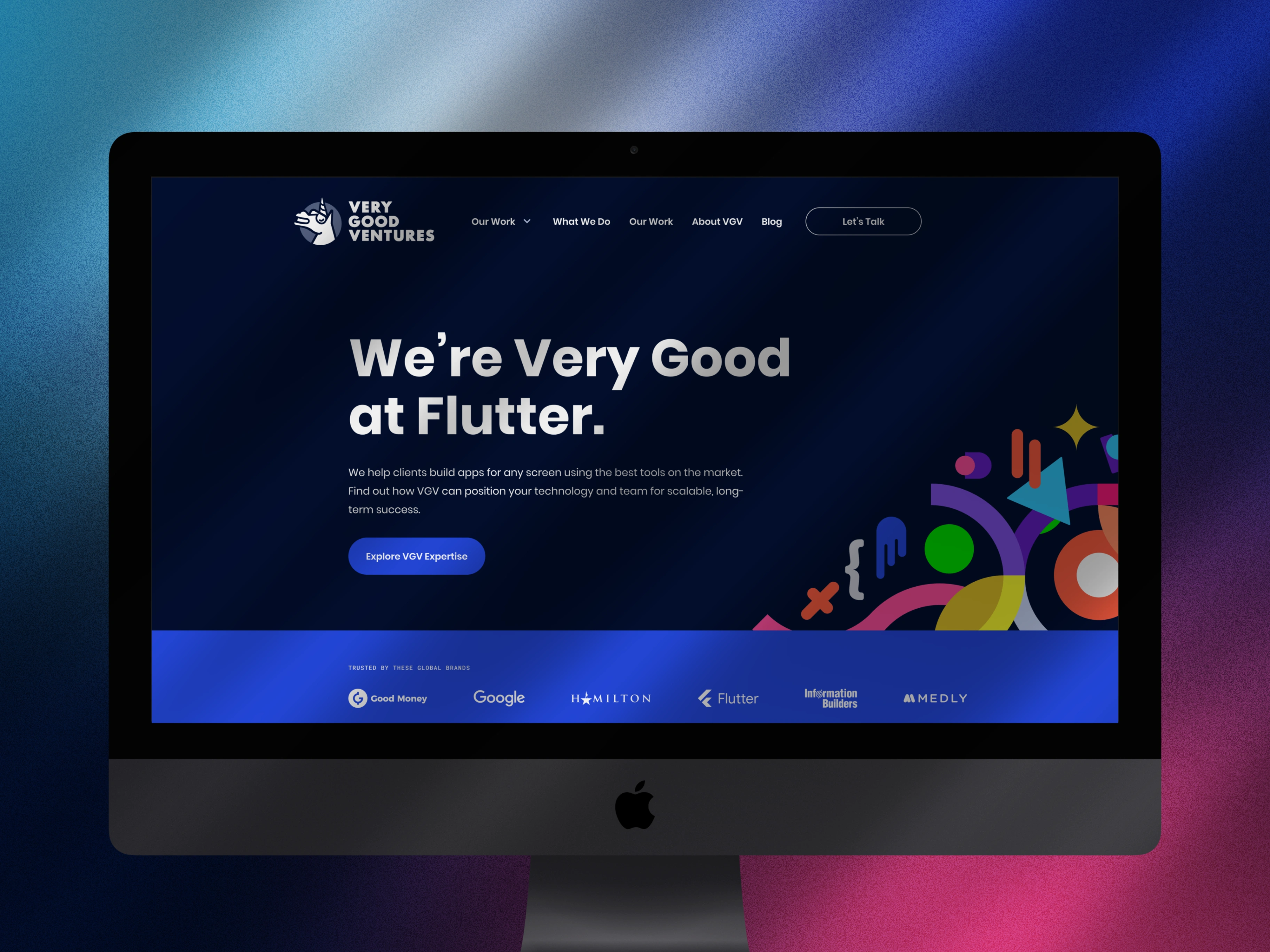
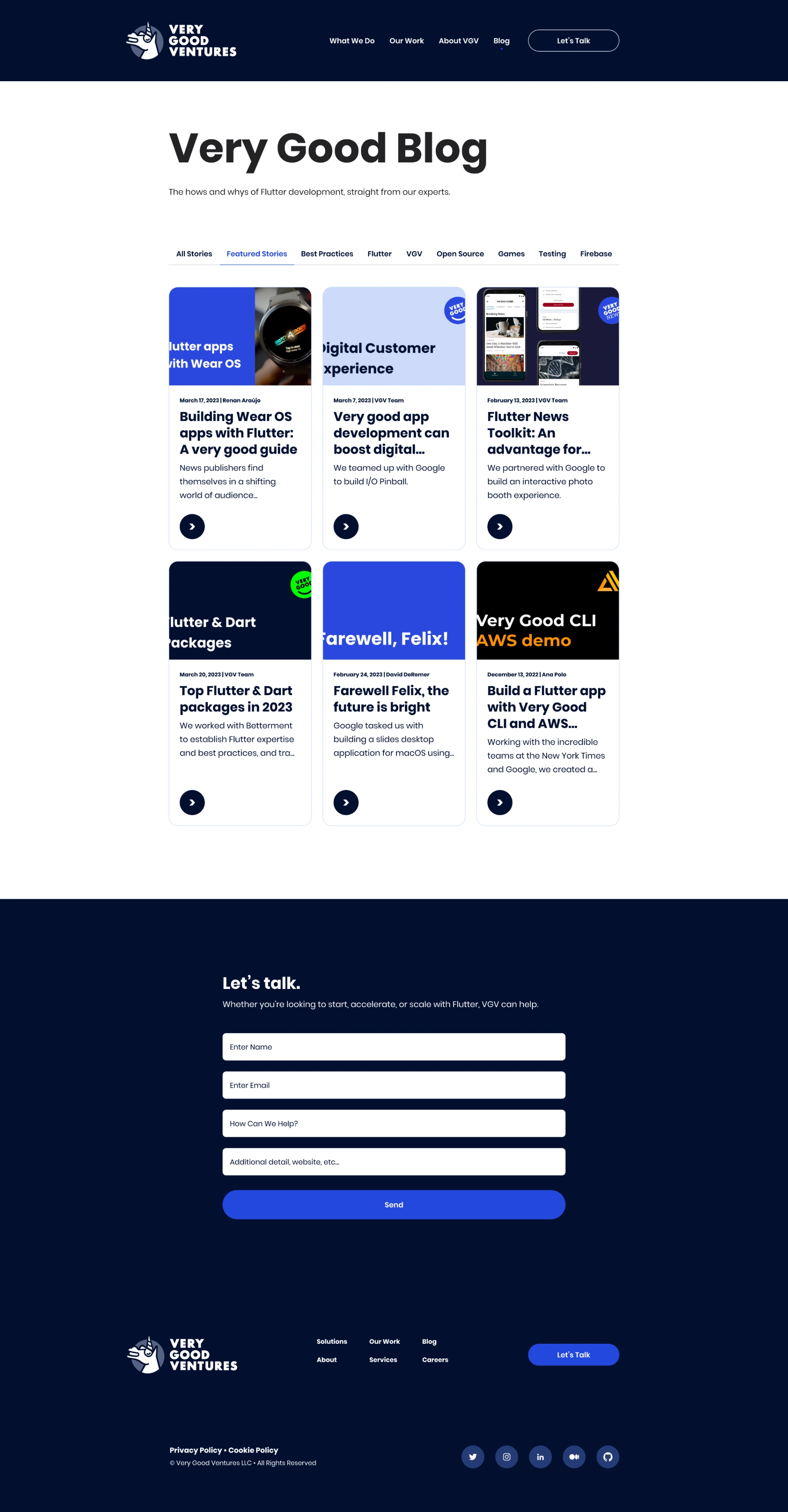
Rebuilding the homepage
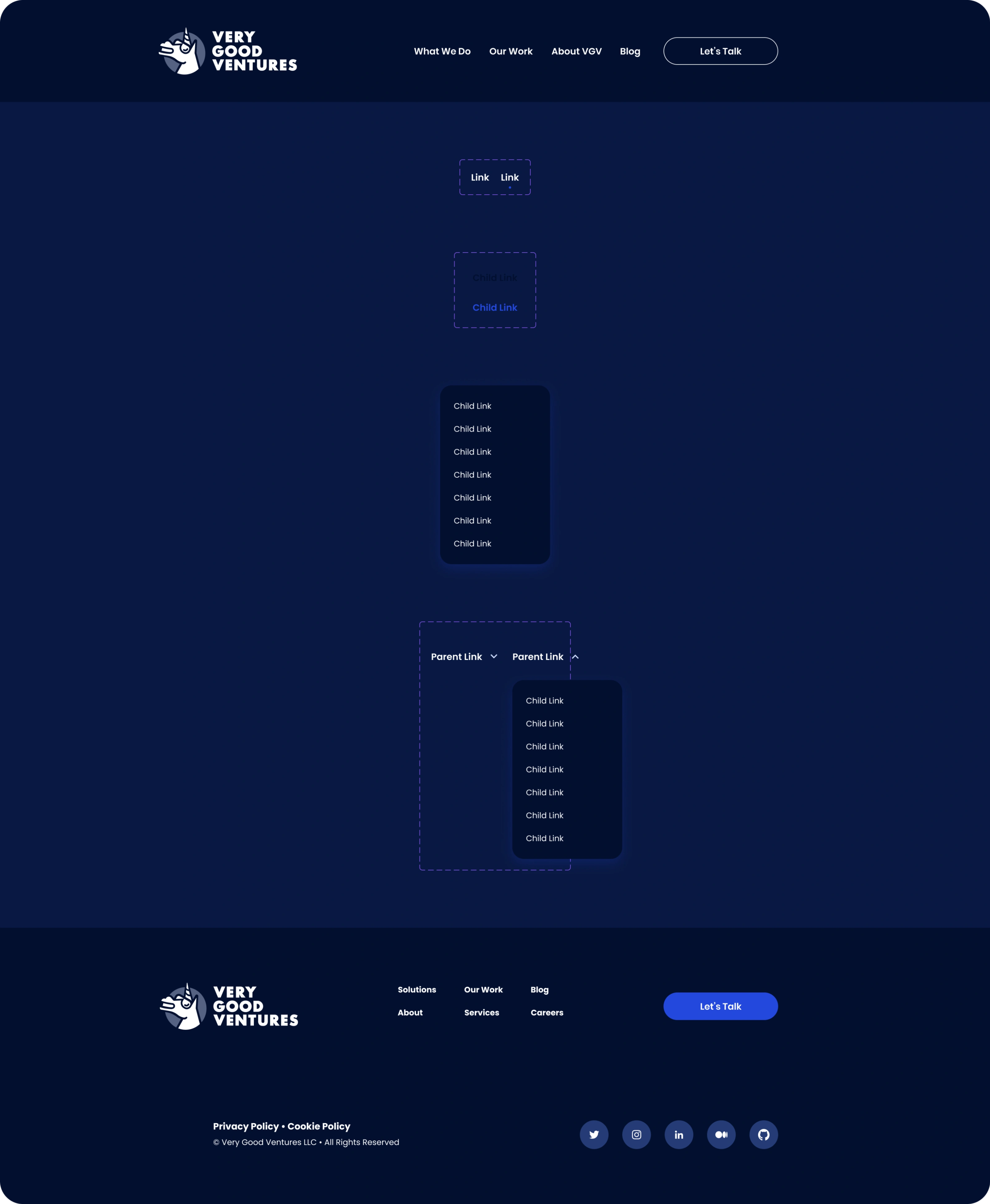
The homepage had to do one job well: orient a senior enterprise buyer in under ten seconds. We restructured it around a clear capability statement up top, followed by an immediate path to proof — flagship case studies surfaced by industry, not buried three scrolls down. The nav went from a growing flat list to a structured system with clear category logic.

Part 05
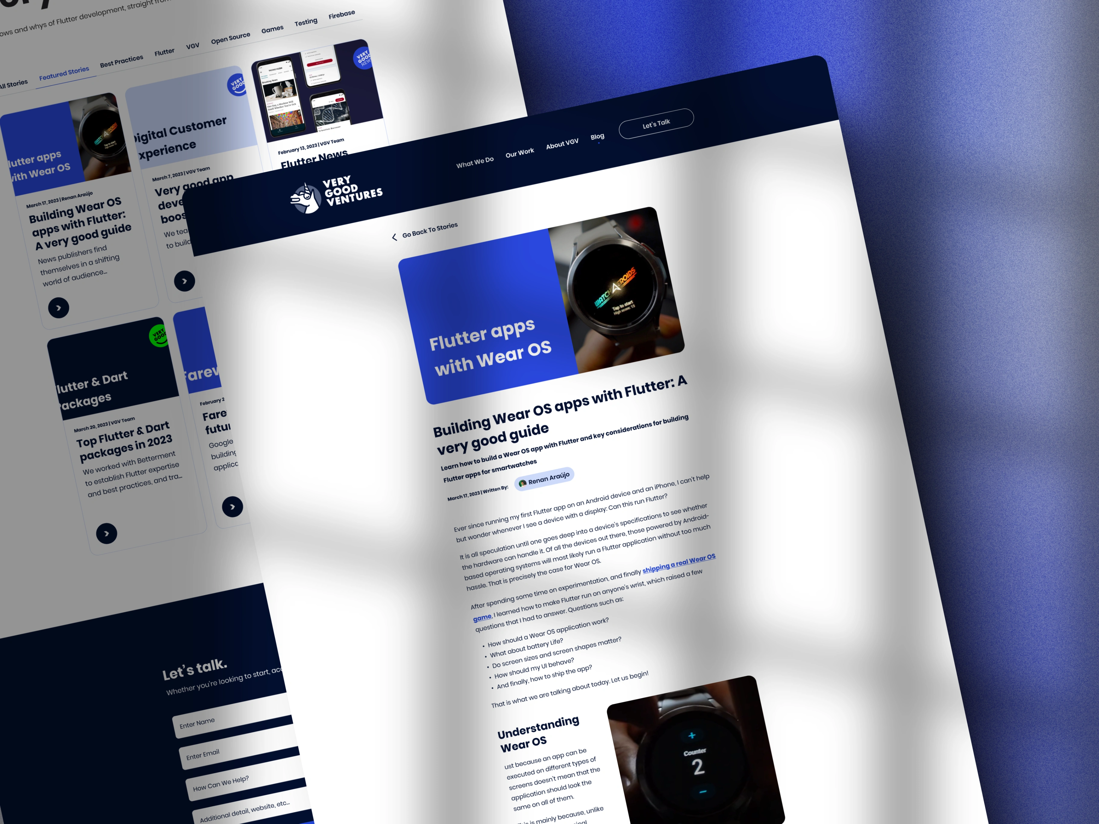
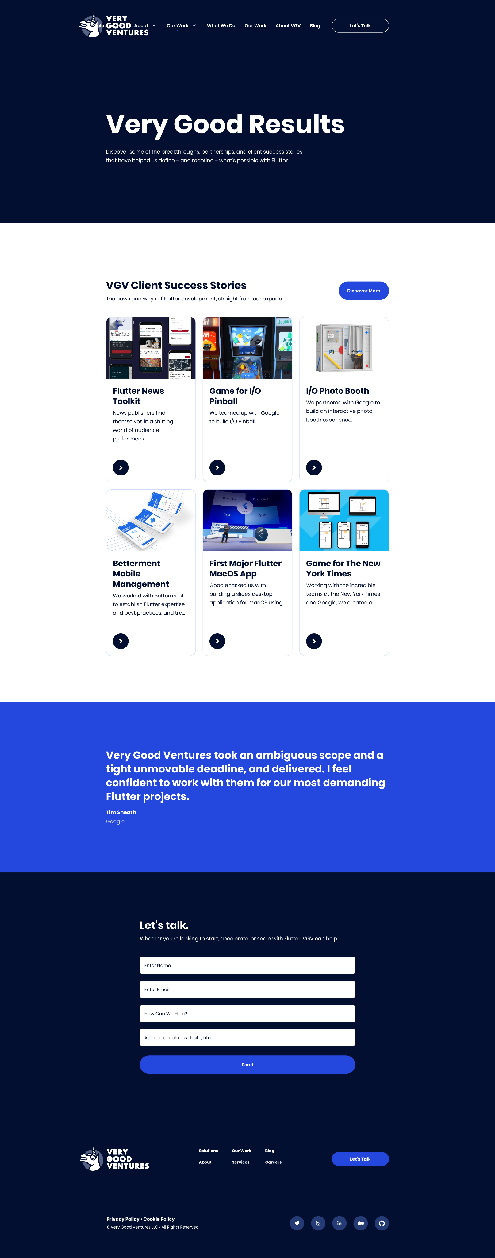
Case study architecture
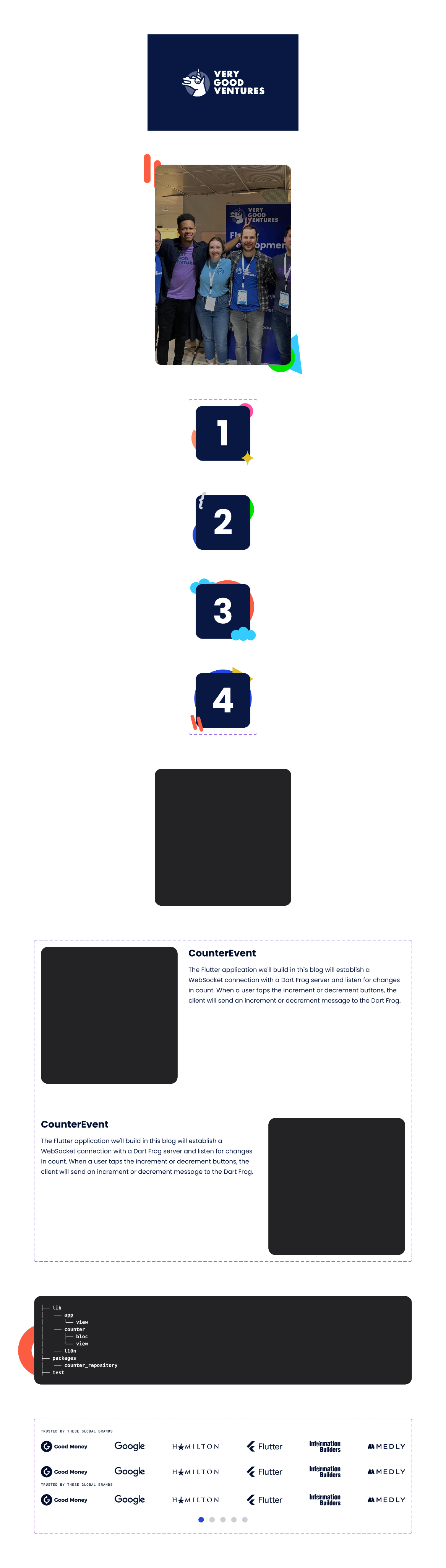
VGV's case studies are their strongest sales asset — Universal, NASCAR, JSX, Hamilton — and the old layout treated them like blog posts. We designed a case study template built for editorial weight: room for context, metrics, and outcome narrative without feeling like a wall of text. The template is flexible enough to handle both short success stories and deep technical writeups.
Part 06
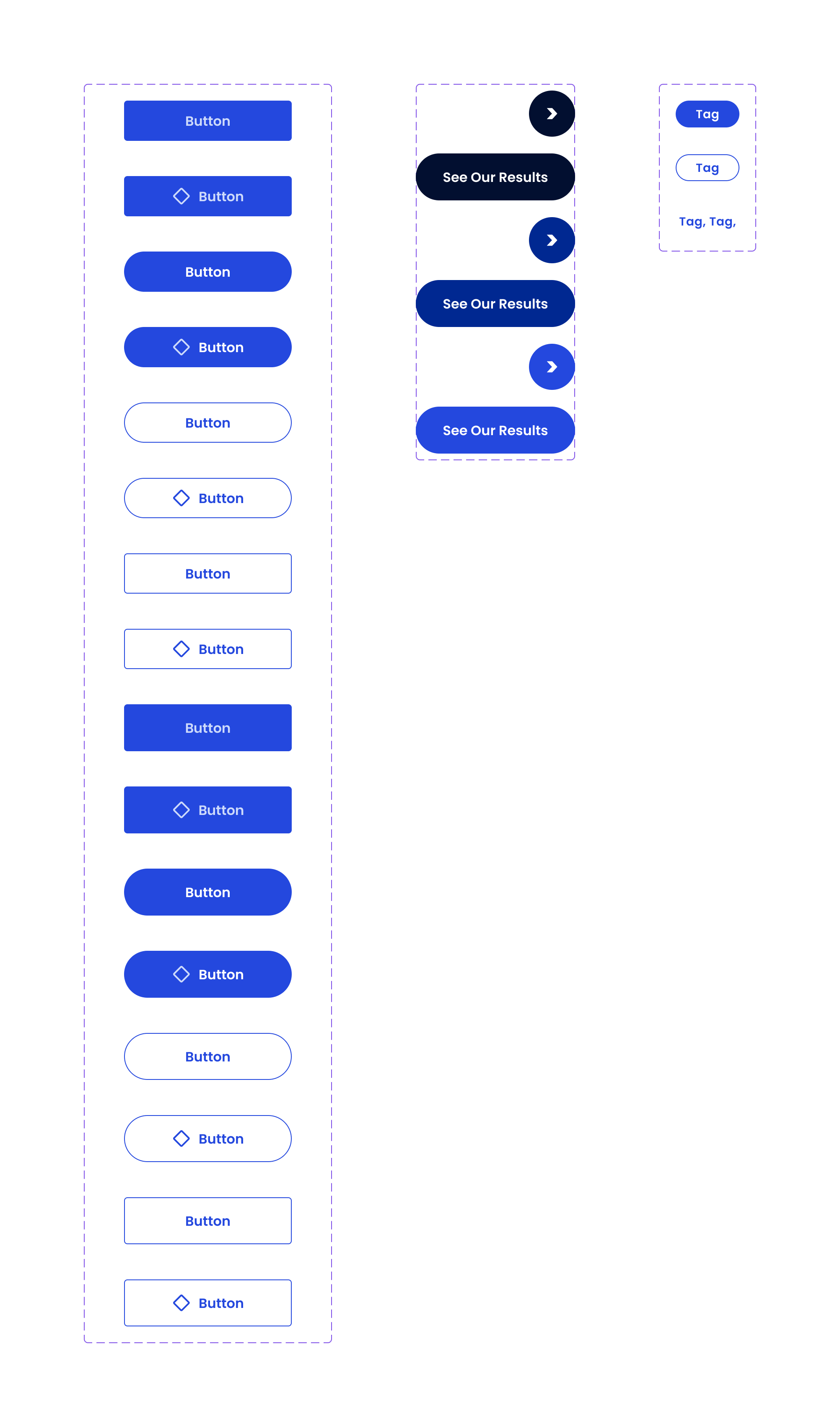
The component system
We delivered a full component library alongside the page designs — not just comps, but a structured set of building blocks that the engineering build could use directly. This meant the frontend stayed faithful to the design intent without a lossy translation step, and VGV's team has a real system to work from when adding new content going forward.

Part 07
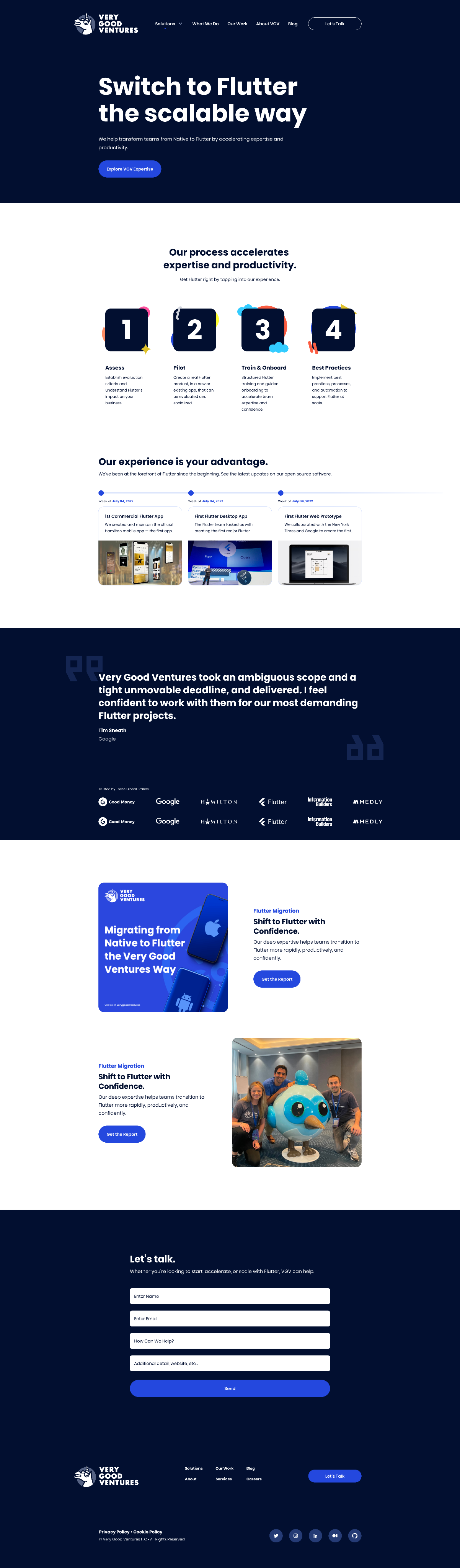
Building in production
Boneyard handled the frontend build end to end. Design and engineering were in the same team throughout, which meant responsive behavior, animation, and component reuse decisions got made once with full context. The build was scoped to handle VGV's content scale — multiple content types, long editorial layouts, and a site structure that needs to flex as the company adds capabilities.
Part 08
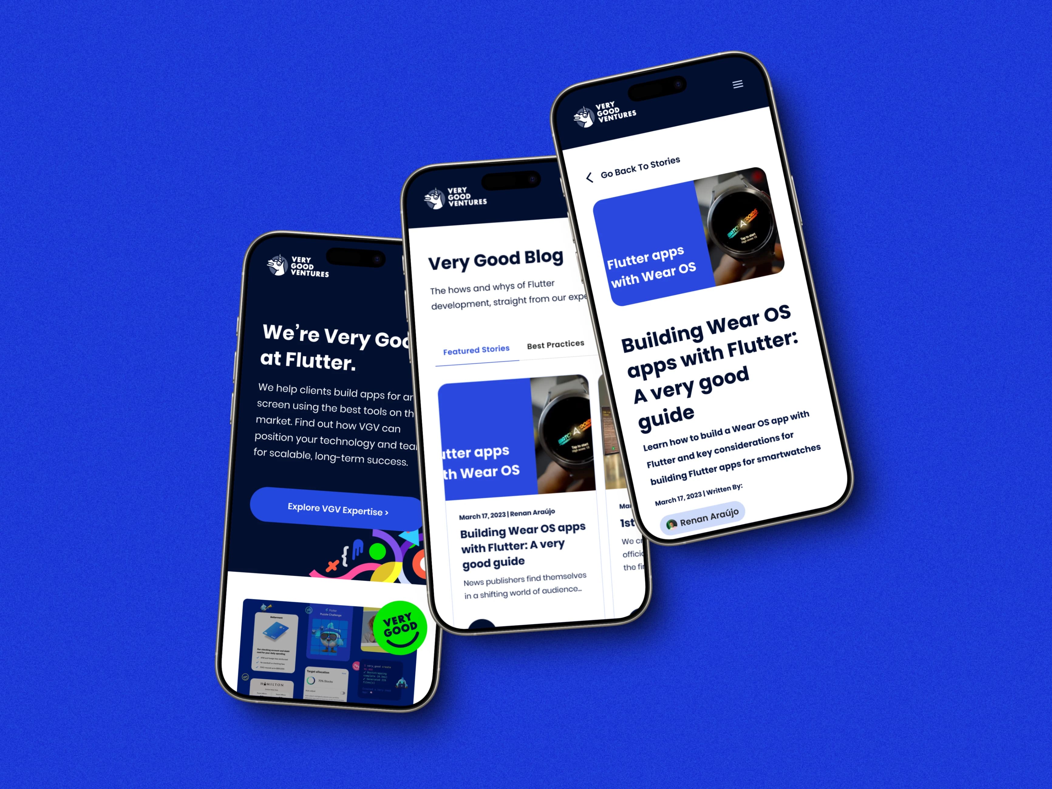
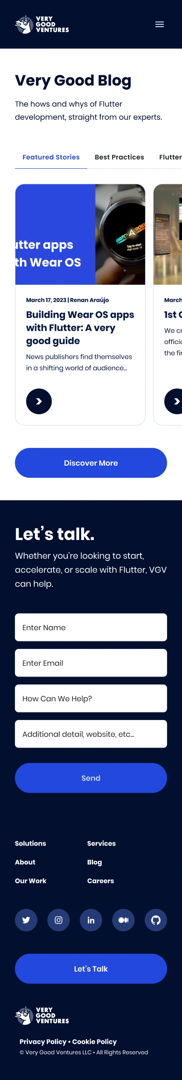
Desktop and mobile, both right
The redesign covered both desktop and mobile from the start — not as an afterthought. Given that VGV's audience includes both enterprise buyers doing research at a desk and practitioners finding them through social or search on a phone, the mobile experience had to be as considered as the desktop one. We designed responsive behavior into the system, not bolted on at the end.
Part 09
A site built for what's next
The finished site gives VGV a visual presence that closes the gap between their actual reputation and what they were projecting. More practically, the component system and page architecture are built to scale — new services, new case studies, new content categories can slot in without requiring a redesign every time the company grows.
Next Project
Spin